How Graphing Stories Allow My Students to Create
LR4.02 – describe a situation that would explain the events illustrated by a given graph of a relationship between two variables (Sample problem: The walk of an individual is illustrated in the given graph, produced by a motion detector and a graphing calculator. Describe the walk [e.g., the initial distance from the motion detector, the rate of walk].);
I break this expectation down into two learning goals that is a little easier for the students to chew on:
#1 – I can write a graphing story that could represent a given graph of a two-variable relationship.
#2 – I can sketch a graph that matches a written graphing story of a two-variable relationship.
Although the second learning goal isn’t really outlined in the curriculum, I think there is value to having students be able to sketch a graph matching a written graphing story.
My Usual Tool: Calculator Based Rangers (CBRs)
While the CBR’s are a great tool to allow students to explore distance-time relationships by completing a TIPS4RM activity called “Walk This Way,” I wasn’t able to get my hands on any and thus had to steer away from the usual. Turned out to be a great way to get me to think a bit differently about how I introduce this concept.
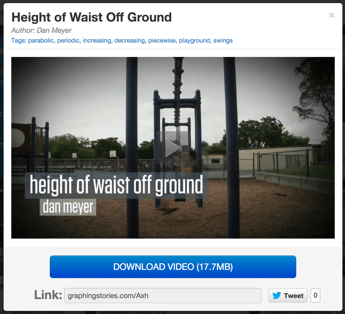
I remembered coming across a Dan Meyer project called Graphing Stories a few months back and this threw me into a great position to really give this resource a shot! If you haven’t stumbled upon this resource, you really need to check it out. Here’s a sample of one of the 21 graphing story videos:
Making Graphing Stories Even Better
The videos on the GraphingStores.com website are great, don’t get me wrong. However, in a recent blog post by Dan Meyer, he discusses some of the reasons graphing stories doesn’t do a great job developing the question. Because of this, I have been working to split the videos up into a “3 act mathematical story” format. I’ll be happy to share with Dan and the Graphing Stories team when complete.
What We Did…
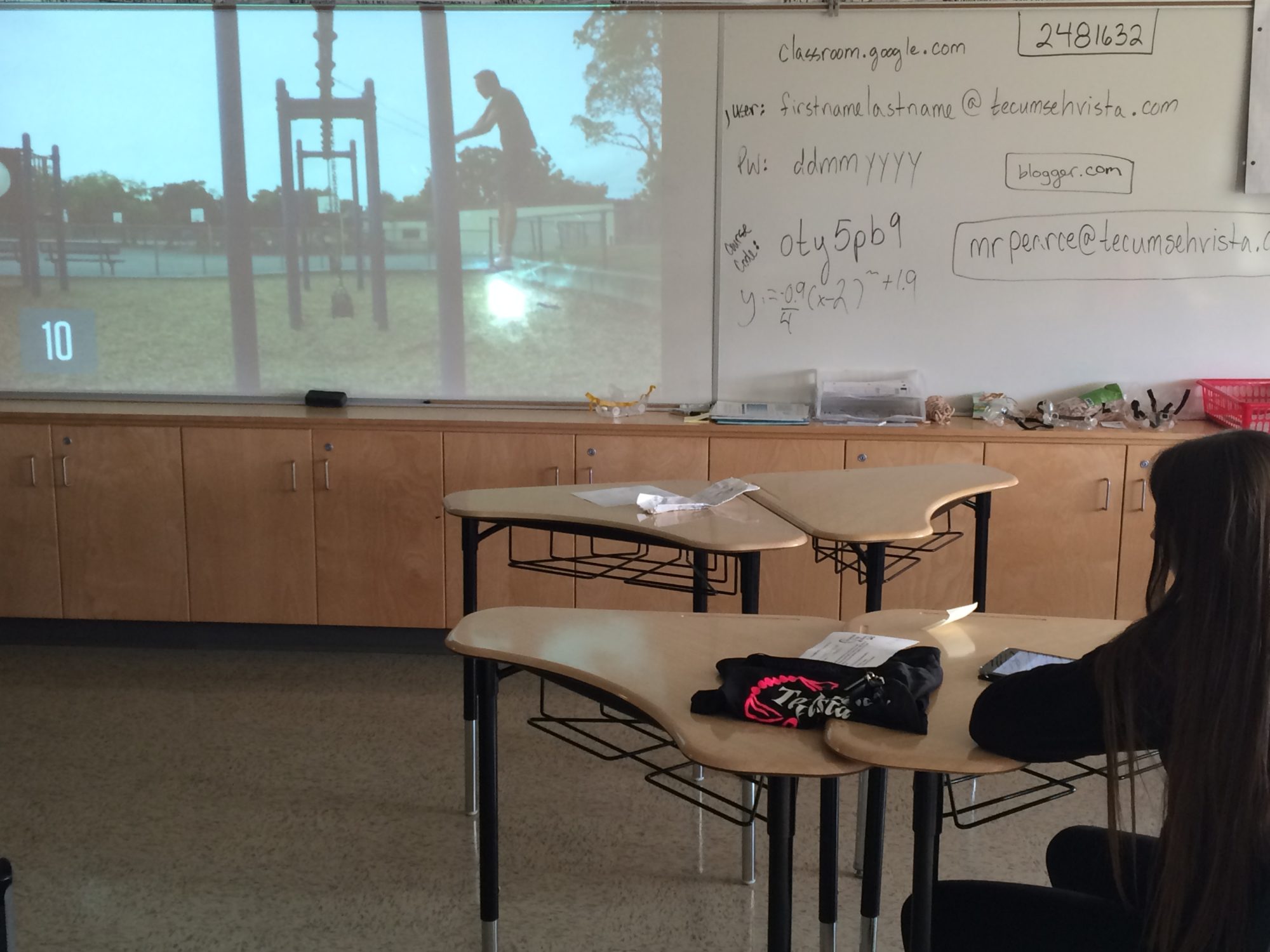
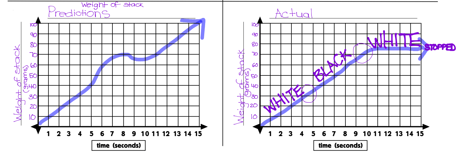
Yesterday, we looked at some of the graphing stories and students made their predictions, we shared out and then we watched the answer. It was great seeing students watching HARD to get their graphs as accurate as possible.


Last Night’s Homework…
With all the fun we had with graphing stories, I assigned students to create their own videos and to make a prediction of what the graph should look like. Here are a couple videos that came back with student work samples (coming soon):
Height of Waist vs. Time
http://youtu.be/quTNLd1nOVo
Height of Bouncy Ball vs. Time
http://youtu.be/G8GaoGBbP-g
Height of Rock vs. Time
Due to the video edits, this one produces an interesting graph…
http://youtu.be/D8oQ6s1_9CQ
Height of Ball vs. Time
http://youtu.be/wRsy-UGi6Ow
Height of Saddle vs. Time
http://youtu.be/BDv9TyxD-s8


This is great—I was just thinking about having students create their own graphing stories this week. Let me know if you have any general tips or feedback.
I can’t get any of the videos to work. DARN! Any ideas?
The original graphingstories.com website that I used for years has been down. Any ideas of the videos are being housed elsewhere? It’s a major bummer – there were so many quality Graphing Stories videos…
https://www.youtube.com/playlist?list=PLDe-CvW870TERO1-IH3CERuyKVFYiFR_Q
Kyle Pearce’s Youtube Channel here seems to house a lot of them.
Thanks Kyle – just realized I’m on your website!